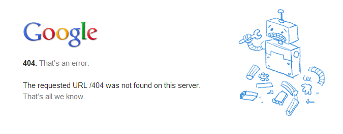
Gone are the days where 404 error pages are specifically meant to notify audience of missing files or web pages. Smart and intelligent website designers have come up with creative error pages that make it do more than just error notification. The page has been optimized to play important role in website conversion process.
The fact that you cannot prevent it from showing up makes it vulnerable to visitors’ visibility i.e., your website visitors or online customers will surely see it one way or the other. The relational and emotional message you pass across through the image and content copy could stir audience interest towards the site.
But, why is it difficult for webmasters to prevent this error page. The reason is simply because most of the causative factors are beyond our control.
Reasons for 404 error page
Error page will display when;
1. Visitors misspell the URL of a web page.
2. A web page is moved to another category/folder.
3. Back-link URLs are incorrect.
4. Page URL is edited or renamed.
5. A page is deleted.
You can see that we have little or no control over this page from displaying. It was suggested to setup a redirect of 404 error page to any important page within the site especially the home page.
How do we manage the impact of the brief and short message visitors will see before they are redirected to the landing page? I feel forwarding with masking should suffice if you don’t want to cache in on the advantage this page can offer.
Importance of 404 error page
– It helps to notify audience that something went wrong somewhere.
– It creates awareness which otherwise could lead to confusion.
– It is an opportunity to show how much you care about your audience.
– It’s also a potent avenue to instill your brand creativity.
– It has the potential of leading visitors into the conversion funnel.
Error 404 page design tips
Make it relate with your website design structures.
The color combination should blend with that of the main website.
Put your logo on it. It’s good for brand recognition.
Include a search box.
It should include links to important pages or category menu.
It is important to create some emotions through image presentation and page content.
Provide link to either submit a ticket or support email address.
You may include a chat box/link if you’re always online.
Just ensure you make the page interactive and emotional.
Top Error 404 Page Designs
- How to Add Post Thumbnail Image to RSS Feed on WordPress - February 16, 2016
- 10 Tips for Getting the Most out of Google Image Search - January 19, 2016
- How to Add Next and Previous Post Links with Thumbnail - January 11, 2016


