 It can be a hard task trying to choose which combination of fonts is best for a particular type of website even though they are now available free in their thousands. These additives (text on computer screen) are responsible for website content readability and accessibility which would ultimately determine the website usefulness and degree of user friendliness. The fact that about 8-15% world population suffer one form of blindness or the other makes it imperative to have an all encompassing plan for font selection if we want our content to capture more audience.
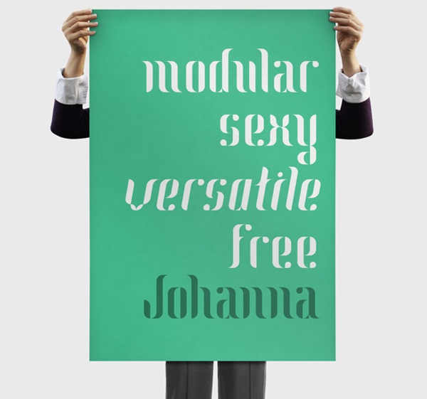
But it can be pretty difficult developing custom fonts especially when the luxury of time is not at your disposal. It happens many times to us and that prompted the need to compile the list below where you can download free font of your choice either for personal or commercial use.
99 Must-Have Free Font For Absolute Web Typography
However, there are salient factors to consider when choosing fonts for both web design and content layout. These are what we need to make our site readable, understandable and user friendly from the perspective of both audience and search engine boot.
Common font: It is better to use common fonts like sans serif (Ariel, Helvetica) because apart from the fact that they are more readable on computer screen they also have standard format and offer high quality print resolution. They are readily available on many devices and major browsers are able to deliver web pages that contain them.
Choose fonts wisely: Not every font is able to render exactly across different platforms if it is not pre-installed. You don’t expect Mac for instant to render as windows if the font used is not installed on it, expect for the opportunity that is now available for audience to install fonts on their browser.
List of fonts : Have more than one fonts and use cascading style sheet (CSS) to loop them into your web page so that when one font is not available it can load the next one and so on.
e.g. body {font-family: Ariel, Helvetica, sans serif :}
Most web designer use fonts like sans serif because it is common, available and easily readable.
Consider you audience: You need to consider the type of operating system your audience are using to access your web page and the fonts installed on them so that your design structure can deliver appropriately. Issues like that haphazard layout in terms of font size going over board would have been tackled.
Take your time: It can be over whelming choosing from thousands of fonts available for free let alone hundreds of custom fonts. You may need to think ahead and visualize the purpose of your site and the complementary fonts that would go with it. Uniqueness in personality and style of presentation are equally good for branding. Just ensure the texts are accessible
Color combination: Color adds glamor to the overall outlook of any website. But, it should be carefully selected when it come to text. For instance you won’t want it combine white background on light colored text. It won’t be readable. White background on black text is the most commonly used combination. It is also a wise idea to use different color on header / title or subtitle.
Test across different platforms: It is a laudable step to verify how fonts display on multiple devices so as to edit, re-set font style or size.
Optimize fonts for responsive design: Use ems or rems measuring parameters to optimize or set font elements to display responsively across mobile devices.
Why Fonts Are Important
– It makes content readable
– It has the capacity website look unique and attractive.
– It adds glamor to overall site structure.
– It enhance SEO if appropriate texts are emphasized within the copy.
– It is one of the fundamental basis for making website user friendly.
- How to Add Post Thumbnail Image to RSS Feed on WordPress - February 16, 2016
- 10 Tips for Getting the Most out of Google Image Search - January 19, 2016
- How to Add Next and Previous Post Links with Thumbnail - January 11, 2016