The existence of mobile website is now stale news but, the statistics that reveals its dominance and the way people connect with business on Smartphone worth more than the cover story of a seasoned magazine.
Believe it or not, people are finding it more convenient to shop using their Smartphone ever than before.
It’s truly easier and more accessible than desktop and laptop. If you are in doubt, the infographic below from Kissmetrics will convince you.
The infographic- Mobile Website Statistics
Do you notice on the infograph that potential buyers shop more on Smartphone than desktop? This shows that you need to optimize your desktop website for mobile if you want to remain in business.
However, there are three major ways by which you can connect your website with mobile-end users.
1. Responsive Website: Responsive website will make your website display dynamically across every form of Smartphone fitting properly on the screen devices. This is recommended by Google. The other good thing is that you still use the same URL as your desktop website which makes it good for both SEO and audience easy access. Good as it may be, I feel it lack structural design outlook for unique brand presentation. But, it is the easiest way to optimize your website for mobile (just get a responsive template and that’s all).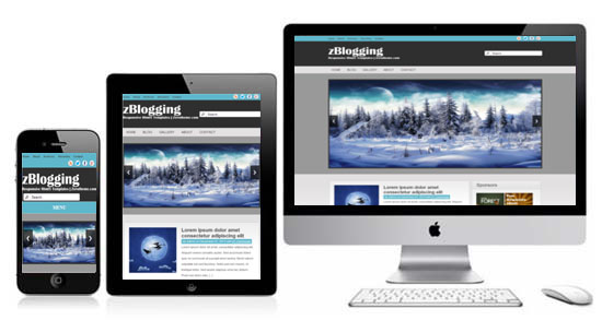
2. Specific mobile website design on a sub-domain: This is good for brand inclined design and it has in-depth design possibilities. The only effect is that it requires another domain like yoursite.mobi; m.yoursite or mobile.yoursite. You’ll have to optimize for SEO so that it rank well on search engine.
3. App mobile website: It is rather hard and more expensive to build and maintain. The effort may worth the while at the end of the day if the right marketing is applied in making the app popular.
Apps are ranked just like website on search engine table. Their rank is determined by the number of downloads, customer ratings and reviews in a world where we have more than 700 thousand applications on Apple Stores and Google Play. It is therefore important to market your app website across social networks, excite customer to rate it and write reviews so as to shore up the rank.
It is important to mention here that it is not the way we setup our mobile website that matters, it is the experience created that connect our brand with audience. We therefore need to check our mobile website whether it has the capacity to influence mobile-end users.
Tips & best practices for mobile website design
These tips and best practices for mobile design would help you set your design priorities right in order to create the best user experience possible.
– Develop a specific front page design.
– Build it to targeted audience.
– Keep your brand features.
– Navigation should be collapsible.
– Use large buttons.
– Make color change when links are clicked or tapped.
– Make text minimal and readable.
– Ensure it load fast (Cache pages).
– Make the entire site simple but, precise.
Won’t you rather put a call through to a website designer for all these and get even much more?
- How to Add Post Thumbnail Image to RSS Feed on WordPress - February 16, 2016
- 10 Tips for Getting the Most out of Google Image Search - January 19, 2016
- How to Add Next and Previous Post Links with Thumbnail - January 11, 2016