There is no doubt to the fact that more people are finding it convenient to use their mobile phones to browse the internet, even including you. Yeah! It’s just because it is handy and always readily available beside us anytime, any day and almost anywhere unlike laptop and desktop computers.
Mobile website is now important for business growth because of the growing use of smartphones.
The following statistics will further instill the gradual mobile website dominance in the way people connect with business and brands.
Mobile website statistics
# 15% of gross Internet traffic comes from mobile traffic.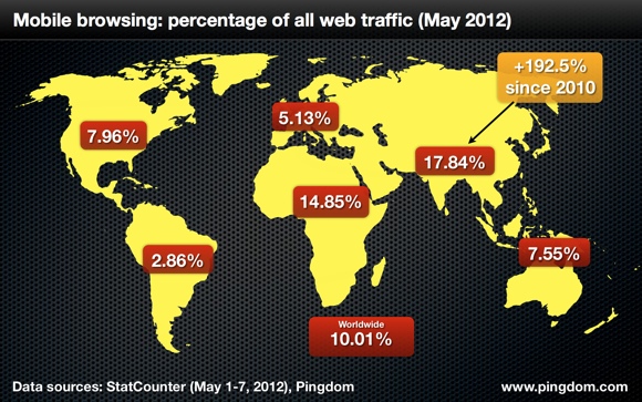
# One quarter of all web searches are now done through mobile-based search engine.
# More than 61% of people understand brands better when they offer a good mobile experience.
# About 60% of mobile-end users use their Smartphone while in a store.
# Also, 50% of these mobile shoppers use their phones on their way to a store.
# The people that use Tablet spend 50% more than PC users. Can you imagine that purchasing power?
# Each Mobile screen size has about 20% of the market share.
Any website without a mobile version that is well developed and designed specifically for mobile-end users will definitely be missing out greatly in connecting with potential customer.
Google understood this perfectly that’s why they came up with howtogomo. To go mobile, we have to understand what mobile website is all about.
What is a mobile website?
It’s simply the mini version of your website that takes care of only the most important information required for audience to understand your brand and do business with you. Mobile website has its own design peculiarities because of the screen size. The general rule is: Keep it simple.
Here are some mobile design tips we adopted when we developed our mobile website.
– It must fit in properly across multiple phone screen void of zooming and left or right scroll.
– The text should be bold to enhance clear and sharp reading.
– The maximum depth of navigation should not be more than two clicks away before customer gets what they wanted. Remember they are on-the-go.
– A ‘Call Us Now’ button should be displayed on all pages for easy access.
– Google map for location description. (Optional)
– It is also expedient to provide a link to the main website should audience seek more information.
It is therefore necessary to check how your website displays on mobile phones and quickly do something about it if you don’t like what you see or if it does not offer good mobile experience to users. You can use the following online tools to see how your mobile website displays across multiple phone screens.

However, people advocates for responsive design (Google also recommended it) which no doubt is simple and good for both SEO and dynamic content base website. I strongly feel is limited in terms of design. It would be great if responsive template designers create a way by which it could be edited and redesigned by end users.
ZeroThemes
Godaddy provide this service free of charge through Duda for primary domain hosted on business class (Deluxe). This requires a separate domain (www.mobile.yoursitename) unlike responsive website that takes up the same domain URL. But, with this package, you are in full control of your mobile site design and development, giving you several design options and SEO features.
Reasons why mobile website is important
It is much more accessible: Mobile website is always available at our finger tips. When a TV or radio AD you are interested in suddenly pop up their website or a fantastic offer with coupon code redeemable via a website link came as text message on your phone or you’re famished in an unfamiliar location and you want a nice restaurant you could eat good food or you’re on vocation and want to explore hotel to check-in and wonderful places visit.
The most likely thing we’ll do is to pick our phone and begin what I call ‘thumb navigation’ instead of waiting to connect a laptop or desktop or wait until we get to a Cafe. Another good side is that it’s cheaper to browse with a phone than laptop or desktop. Little wonder why people turn to competitors whenever they experience poor mobile usability.
Mobile audience movement is fast and growing bigger by the day: Compuware predicted statistically that by 2015 there would be mobile application for everyone on the surface of the earth. That’s about 7billion plus, estimated futuristically. In the same vein, Google reveal that the number of searches done through mobile is increasing exponentially.
Sincerely, the future of mobile is huge because people want to do a lot of things within the best reasonable time and get those things done in the most convenient way possible. So, prospective customer would continue to explore different options geared towards getting these expectations met.
The earlier we’re awake to this responsibility the better our business growth. The buyers are now the king and not the seller anymore. They have been inspiring and influencing consistently the thoughts of smart and creative business owners through multiple feedback channels.
Opportunity for growth: There is huge opportunity for growth for any business that connects with mobile-end users. Apart from the fact that only few businesses are optimizing their business for mobile presence, mobile website can create the exposure that would connect your brand with potential customer which otherwise could cost a fortune.
Branding: People absorb brand better and faster on mobile when they are satisfied with the experience. This present an opportunity to leverage on mobile to provide brand specific design that can be easily assimilated.
Right or wrong, mobile website seems to be the way to go to build brand online. What do you think?
- How to Add Post Thumbnail Image to RSS Feed on WordPress - February 16, 2016
- 10 Tips for Getting the Most out of Google Image Search - January 19, 2016
- How to Add Next and Previous Post Links with Thumbnail - January 11, 2016